
From The Washington Monthly:
“Edward Tufte occupies a revered and solitary place in the world of graphic design. Over the last three decades, he has become a kind of oracle in the growing field of data visualization—the practice of taking the sprawling, messy universe of information that makes up the quantitative backbone of everyday life and turning it into an understandable story. His four books on the subject have sold almost two million copies, and in his crusade against euphemism and gloss, he casts a shadow over the world of graphs and charts similar to the specter of George Orwell over essay and argument.”
“This,” he said, “is War and Peace as told by a visual Tolstoy.” The map is about the size of a car window, and follows the French invasion of Russia in 1812. It was drawn in 1869 by a French engineer named Charles Joseph Minard. On the left of the map, on the banks of the Niemen River, near Kovno in modern-day Lithuania, a horizontal tan stripe represents the initial invasion force of 420,000 French soldiers. As they march east, toward Moscow—to the right, on the map—they begin to die, and the stripe narrows.
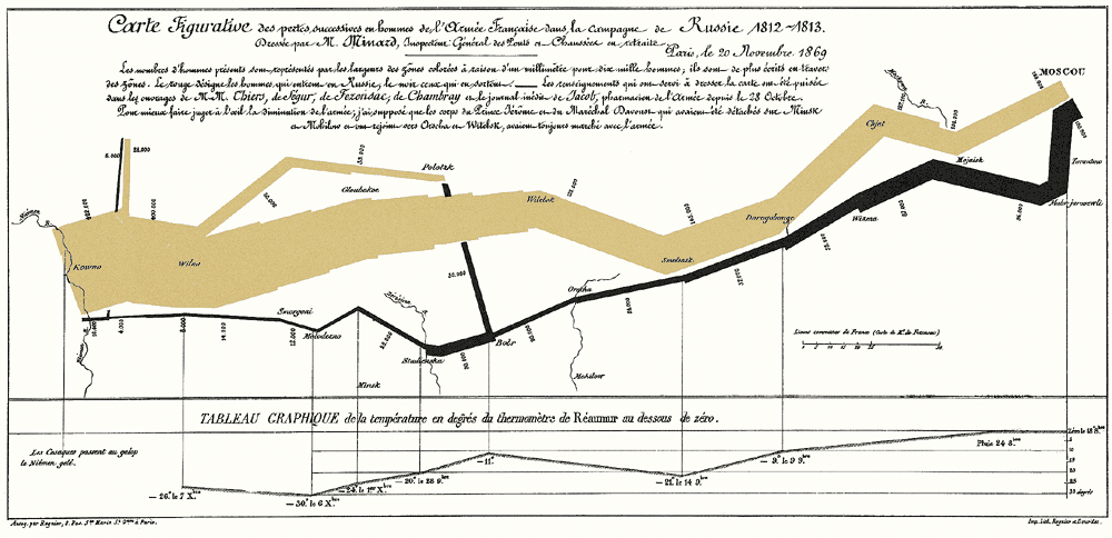
The map itself is elegant and restrained, but it tells the story of a sprawling, bloody horror: cold and hunger begin to finish off whatever French soldiers the Russians haven’t killed in battle. As the French army retreats, the tan line turns black and doubles back on itself to the left, or to the west, away from Moscow. A series of thin gray lines intersect the path of the army, showing the winter’s cruel temperatures. On November 9 it is 9 degrees below freezing. On November 14, it is 21 degrees below.
Then, on the 28th of November, a catastrophe: in a rush to cross the Berezina River, half of the retreating army, 22,000 men, drowns in the river’s icy waters. The black line, already thinned to a fraction of its initial size, abruptly reduces by half. Finally, in late December, six months after they set off, the surviving French soldiers cross back over the Niemen River. The map shows their number: 10,000 men. Ultimately, only one in forty-two soldiers survives the doomed campaign.
Tufte pointed to the far left of the map, where the tan and black lines intersect. “And it is there,” he said, “at the beginning and at the end of the campaign, where we have a small but poignant example of the first grand principle of analytical design”: above all else, always show comparisons.”